
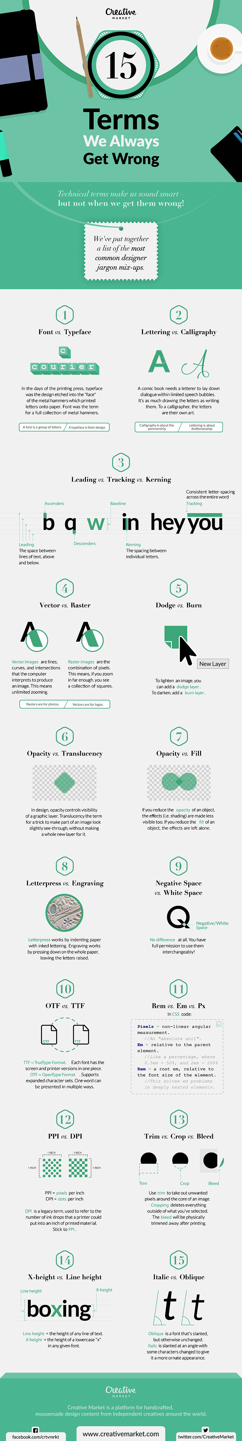
Graphic design is a creative field that combines art and technology to communicate ideas. Designers use color, type, imagery, layout, and other techniques to create logos, publications, websites, advertisements, and more. The graphics industry employs terms and phrases to describe elements, principles, software, techniques, and workflows. With an abundance of ever-evolving terminology, it’s no wonder that some well-intended designers use words incorrectly. This article will clarify 15 commonly confused graphic design terms and help you avoid making mistakes in your own work.
Font vs. Typeface
One of the most misused terms in graphic design is “font” when the correct word is actually “typeface.” A font is a specific style of type within a typeface family. For example, Arial Bold is a font, while Arial is the typeface. There are many different fonts that make up a typeface. The fonts share an overall look but have variations in weight, width, style, and size (1).
Typefaces are either serif or sans serif. Serif typefaces have small lines at the ends of each letterform, while sans-serif styles do not. Popular serif typefaces include Times New Roman and Garamond. Some well-known sans serif typefaces are Arial, Helvetica, and Century Gothic (2).
When choosing a font, consider its context. Serif fonts are traditionally used for print books and articles because the serifs help guide the eye easily from letter to letter. Sans serif fonts have a modern, minimalist look that pairs well with digital interfaces. Compare the usage of each style and select fonts that match the tone you want to convey (3).
Using the terms “font” and “typeface” correctly gives designers credibility and shows you understand the nuances of typography. Next time you reference a font, double-check that you actually mean the specific style and not the overall typeface.
Raster vs. Vector
Raster and vector are two distinct image types that each suit different purposes. Knowing the difference allows designers to choose the correct format for their projects.
Raster images are composed of a grid of pixels, which are small squares of color information. Common raster formats include JPEG, PNG, GIF and BMP. Raster imagery is resolution dependent, meaning the image quality decreases when resized, especially if enlarged. These pixel-based images are best suited for photographs and web graphics (4).
Vector images are created through points on a geometric plane that form lines and shapes. Some vector formats are AI, EPS and SVG. Vector graphics can scale infinitely without any loss of image quality. Logos, illustrations and type are often created as vectors so they can be resized as needed without sacrificing clarity (5).
A helpful distinction is that raster images are better for continuous tone graphics, while vectors excel at geometric shapes and objects with flat color. Smart designers think ahead and produce assets in the optimal format. Using the wrong image type can result in blurry, pixelated graphics that reflect poorly on the designer. Being articulate about raster versus vector shows experience with digital images.
Pantone vs. CMYK
Pantone and CMYK are two leading color models used in design and printing. Pantone is a proprietary spot color system. CMYK (cyan, magenta, yellow, and black ink) makes up the 4-color process used in full-color printing. Designers should realize these models have unique purposes (6).
Pantone spot colors are premixed inks manufactured specifically by the Pantone Company. Each Pantone shade has an associated number code. For example, Pantone 219 is also known as PMS 219 or Pantone 219 C, referring to the Coated paper stock used. Spot colors create vivid solid shades when printed on paper, plastic and other materials. Branding projects like logos often utilize Pantone colors for maximum color control and consistency across applications (7).
The CMYK color process mixes percentages of cyan, magenta, yellow and black inks to generate a wide range of colors. This method works really well for printing full color images. Since mixing CMYK builds up layers of ink, the resulting hues are slightly duller than their Pantone counterparts. CMYK is better suited for color photographs and designs with gradient tones rather than minimalist branding projects (8).
Professionals specify Pantone colors for logos and other solid elements that need reproducible color. CMYK works for complex designs and photographs with intricate color. Recognizing when to use each color model demonstrates graphic design knowledge.
dpi vs. ppi
The terms “dpi” and “ppi” are sometimes used interchangeably, when they actually measure two different aspects of digital images. Understanding the distinction can help designers properly prepare and convert image files.
Dpi stands for dots per inch and indicates print resolution or print quality. Standard dpi for offset printing is 300. Images must have a high enough dpi to print cleanly without evident pixels or blurriness. Too low of a dpi results in pixelation and uneven colors (9).
Ppi means pixels per inch and describes digital display resolution. A common ppi for web and phone displays is 72. Images only need to be 72 ppi for sharpness on screens. Higher ppi wastes file size without improving onscreen image quality. For print usage, ppi should match the desired print dpi (10).
For the best quality, designers optimize files to have appropriate dpi for print usage and ppi for digital display. Being clear about dpi versus ppi requirements helps when exporting images from editing programs. This understanding also aids in setting document resolution when creating new designs intended for either print or digital formats. Distinguishing between dpi and ppi terms demonstrates graphic design acumen.
Lossy vs. Lossless Compression
Compression reduces the file size of images by removing extraneous data. The two main types, lossy and lossless, save space through different processes. Designers apply compression judiciously to avoid unwanted effects.
Lossy compression shrinks files by permanently eliminating pixels and fine details in the image. JPG files utilize lossy compression. The greater the compression applied, the smaller the file but also the more data loss or artifacting. For photographs, small losses don’t usually degrade quality, but lossy process can create noticeable blurring and distortion in logos and line art (11).
Lossless compression condenses files by consolidating redundant pixel information. No data is deleted, so when uncompressed, the original image integrity is intact. Common lossless formats are PNG, GIF and SVG. Logos and illustrations should always be saved with lossless compression to prevent deterioration of key details (12).
Smart designers choose lossy compression for complex photographic images intended for screen or standard print reproduction. Lossless works best for retaining crispness in logos, graphics and illustrations. Specifying these compression methods when exporting and saving files verifies graphic design knowledge.
Bleed vs. Trim
Print projects require additional image past the final trimmed paper edges. This extra image area is called bleed. Trim lines delineate the borders where paper will be cut. Designers must understand bleed and trim to create print files correctly (13).
For professional results, bleed extends 1/8 inch or more beyond the trim edge. This prevents thin white margins if the paper shifts slightly during cutting. Any design elements meant to print fully to the edge must extend into the bleed zone so no gaps show after trimming (14).
Trim lines mark where cuts will be made to the paper sheet. The final printed piece will be cropped on the trim lines. Trim size dimensions must match the desired end product specifications. Commercial printers require layouts to provide bleed and trim lines to properly produce the job (15).
Neglecting bleed and trim details can ruin otherwise good designs. Providing proper bleed and trim displays graphic design aptitude. The ability to explain these requirements also gives designers credibility during print projects.
RGB vs. CMYK (again)
The RGB and CMYK color modes were explained previously, but their importance bears reiterating. The capability to adjust designs from RGB to CMYK and back again is critical for designers.
RGB stands for red, green and blue light additive color. Computer monitors, televisions, mobile devices and digital projectors all use RGB color. This bright backlit color works well for presentations, websites and videos (16).
CMYK is cyan, magenta, yellow and black ink subtractive color. When combined on paper, the CMYK inks absorb color wavelengths and reflect others back to our eyes. Print publications require CMYK because it can be reproduced reliably on presses (17).
Design initially occurs in RGB color mode. Visuals retain vibrancy on screen. Once artwork is finalized, designers shift the palette to CMYK to account for the ink and paper behavior. This prepares the files for commercial printing. Neglecting this conversion results in colors shifting noticeably from original digital files to printed pieces. The most professional designers work competently in both RGB and CMYK modes.
DPI vs. LPI
Both DPI (dots per inch) and LPI (lines per inch) quantify printed image resolutions, but to measure different characteristics. Knowing both is imperative for quality print results.
DPI indicates the output resolution of each color. It measures the number of ink dots printed per linear inch. Standard offset printing dpi is 300. Images must have sufficient dpi to render details accurately (18).
LPI specifies the line screen frequency used to print an image. This equates to the number of rows of halftone dots per inch reproduced on press. Common LPI for paper stocks are 133 and 150. Higher dpi allows higher lpi and thus finer visible gradations (19).
For a 300 dpi press run, 133 lpi offers good detail with minimal rosette patterns. Combining 300 dpi and 150 lpi maximizes detail for the best print quality. Specifying dpi and lpi correctly ensures files are crafted for ideal printed reproduction. Stating these correctly gives designers professional authority.
PDF vs. PDF/X
Exporting layouts as PDF files is common practice in graphic design. However, there are important reasons to save PDF/X files instead of standard PDFs for commercial printing purposes.
PDF, or portable document format, is an image file type that can contain vector, raster and text data. PDFs can be used to share electronic documents across devices and operating systems. However, regular PDFs may contain transparency and objects that create issues in professional printing (20).
PDF/X modifies the PDF format to ensure files have only CMYK and spot colors and removes transparency to prevent printing problems. PDF/X-1a is a popular and reliable standard among printers. This iso standard also embeds fonts and compresses images for quality and consistency (21).
For digital sharing and page layout proofing, standard PDFs suffice. To print professionally, PDF/X-1a is strongly advised. Expressing this difference speaks knowledgably about file preparations for commercial press runs.
Pixels vs. Vectors
Understanding the difference between pixels in raster images and vectors in artwork helps designers select formats to best display content.
As described earlier, raster images comprise grids of square pixels in rows and columns. Each pixel contains color mode and tonal information. Photos have many blended pixels to render subtle gradations. But raster images become jagged or blurry if resized substantially (22).
Vectors are points and paths that can infinitely scale and reshape without compromising visual integrity. Logos, illustrations and type are commonly vector-based. The anchor points and lines contain geometric data to regenerate shapes and colors smoothly at any size (23).
Pixels suit photographic images well because they blend to mimic continuous tones. Vectors work for logos, text and graphic elements that need to be resized without degradation. Articulating this distinction appropriately conveys graphic design expertise.
Descender vs. Ascender
Legibility requires distinction between lowercase letter descenders and ascenders. Designers must recognize the difference to format type properly.
Descenders are the parts of lowercase characters that extend below the baseline, or bottom alignment of most letters. Common examples are the tails on g, j, p, q and y (24). Proper typesetting has enough line spacing, called leading, to prevent descenders from touching lines below.
Ascenders rise above the x-height center axis of lowercase letters. Familiar ascender forms are on b, d, f, h and k (25). Again, adequate line spacing prevents ascenders colliding with lines above.
If lines of text are too tight, descenders and ascenders bump into neighboring lines of type. Even slight touching reduces legibility and gives text a muddy, cluttered appearance. Professional designers carefully adjust leading so descenders and ascenders have open space. Identifying and explaining these terms demonstrates design skills.
Resolution vs. Size
These two digital image traits are related, but resolution and size have distinct meanings. Knowledgeable designers properly balance both to craft quality visuals.
Resolution measures the pixels within a given image dimension. Resolution is expressed in pixels or dots per inch. Standard resolutions are 72 or 96 ppi for screen and 300 dpi for print (26). Higher resolutions have smaller, denser pixels and reveal finer detail.
Image size equates to measurable dimensions in height by width. Common digital sizes include 1280 x 720 pixels up to 3840 x 2160 pixels. Print sizes range from business cards to billboards. Enlarging an image expands size while retaining existing resolution (27).
For sharp results, size should correlate appropriately to resolution. Enlarging a low resolution picture will show individual pixels and jagged edges. Optimizing resolution for the intended size makes detailed, high-quality images. Articulating this relationship speaks fluently about crafting professional visuals.
Lossy vs. Lossless Compression
Previously we discussed lossy and lossless image compression. The versatility to apply both appropriately bears repeating as a key graphic design skill.
Lossy compression like JPG permanently deletes image data to reduce file size. Some data loss is okay for complex photographs. But the process can introduce unsightly artifacts in logos and illustrations (28).
Lossless PNG, GIF, and SVG compression squeezes files through consolidation without removing data. No quality is lost when images decompress. Retaining integrity is vital for logos, diagrams, and other images with flat colors and sharp edges (29).
Smart designers use lossy compression for detailed photographs and lossless compression for logos and line art. The ability to explain these techniques and match optimal compression methods to image types is a hallmark of professional visual communication skills.
Dithering vs. Antialiasing
Visual tricks like dithering and antialiasing improve the appearance of images. However, each method has specific uses. Understanding their strengths assists designers.
Dithering uses a pattern of dots to simulate a wider range of colors and tones than is actually available. This optical illusion reduces obvious color banding in images with limited color depth (30).
Antialiasing smooths jagged pixel edges into softer graduated tones. The technique helps curve and angle shapes that contrast against background colors (31).
Dithering mimics continuous tone with fewer solid colors. It’s commonly used with indexed color palettes. Antialiasing diminishes the stair-step effect along sharp diagonal and curve shapes. Designers may activate antialiasing in vector drawing programs. Distinguishing appropriate uses of dithering and antialiasing gives designers flexibility.
Print vs. Web Color
One final essential distinction for graphic designers is optimizing color for the intended output of print or web. Print utilizes CMYK colors, while screens display RGB.
As previously outlined, CMYK refers to the cyan, magenta, yellow, and black ink colors that combine to print full-color images. The percentage mixtures generate the gamut of hues in the printed piece (32).
RGB are the red, green, and blue light wavelengths emitted by screens. Different combinations make a wide range of colors. But RGB has an inherently larger gamut than printable CMYK hues (33).
The design initially occurs using RGB colors. However, designers must convert artwork to CMYK to print accurately on paper. Optimal colors for web pages and digital displays only use RGB. Clarifying and properly preparing color for print versus digital mediums is imperative for graphic designers.
Conclusion
References
Knowing essential graphic design terminology gives professionals and amateurs alike credibility and skills. This article reviewed fifteen visual communication terms that are often misunderstood or interchanged. Proper application of these vocabulary words lets designers speak about their craft with accuracy. From font vs. typeface to raster vs. vector, RGB vs. CMYK, and beyond, these distinctions impact the quality and capabilities of graphic design work. Use this reference to expand your knowledge and produce compelling graphics for both print and digital media.
- Lamb, B. (n.d.) Font or Typeface? What’s the Difference? www.designworkshop.com https://www.designworkshop.com/tips/font-typeface-difference.html
- Will-Harris, D. (2019) What’s the Difference Between Typeface vs Font? 99 Designs. https://99designs.com/blog/tips/difference-between-typeface-and-font/
- Lupton, E. (2010) Thinking with Type: A Critical Guide for Designers, Writers, Editors, & Students. Chronicle Books.
- Burge, D. (2019) Raster Image vs Vector Image—What’s the Difference? Oxford Academy. https://www.oxfordacademy.com.au/blog/posts/raster-image-vs-vector-image-whats-the-difference
- Locascio, J. (2021) Difference Between Raster and Vector Images. Digitize Type. https://digitizetype.com/raster-vector-images/
- Kessler, S. (n.d.) CMYK vs Pantone: Which is Right for You? www.logobly.com https://www.logobly.com/blog/cmyk-vs-pantone-which-is-right-for-you/
- Antonelli, R. (2020) Pantone Color System: A Comprehensive Guide. Oberlo. https://www.oberlo.com/blog/pantone-color-system
- PrinterPrezz. (2021) CMYK vs Pantone – Which one should you use and why? https://www.printerprezz.com/cmyk-vs-pantone
- Frazier, C. (2019) How To Understand Pixels, Resolution & dpi. Photography Concentrate. https://photographyconcentrate.com/pixels-resolution-dpi
- Stokes, T. (2019) PPI vs DPI: what is the difference? Creative Bloq. https://www.creativebloq.com/digital-art/ppi-vs-dpi-1134098
- Canto, C. (2019) Image Compression: An Overview of Lossy vs. Lossless. Peachpit. https://www.peachpit.com/articles/article.aspx?p=2244353
- Faulkner, A. (n.d.) Lossless vs Lossy Image Compression: All you Need to Know. www.makeuseof.com https://www.makeuseof.com/tag/lossless-vs-lossy-image-compression-need-know/
- Millmore, M. (2015) Bleed and trim explained. Creative Bloq. https://www.creativebloq.com/print-design/bleed-and-trim-explained-1012985
- Wright, N. (n.d.) Bleeds & Trims. www.evont.co https://evont.co/resources/bleeds-and-trims
- Watrall, M. (2018) How To Set Bleeds and Print Marks like a Pro. www.canva.com https://www.canva.com/learn/bleeds-print-marks/
- Ciotti, G. (2021) RGB vs CMYK: Color Models for Print vs Digital Design Explained. www.coschedule.com https://coschedule.com/blog/rgb-vs-cmyk/
- Salem, J. (2019) CMYK vs RGB Colors for Print and Digital Projects. ClikkPrints. https://www.clikkprints.com/cmyk-vs-rgb-colors-for-print-and-digital-projects/
- Karthikeyan, K. (2020) Difference Between DPI and LPI in Printing. Dunith Systems. https://www.dunith.com/blog/difference-between-dpi-and-lpi-in-printing.php
- redriver. (2019) DPI vs LPI: The Difference and How They’re Related. www.redrivercatalog.com https://www.redrivercatalog.com/dpi-vs-lpi-how-theyre-related.html
- MacDonald, N. (2022) PDF/X-1a:The Designer’s Guide to Print Production. Book Printing UK. https://www.bookprintinguk.com/pdfx-1a-designers-guide/
- Rees, S. (2018) What is a PDF/X-1a file? www.missprint.com https://www.missprint.com/blog/2018/04/26/what-is-a-pdfx-1a-file/
- Burge, D. (2019) Raster Image vs Vector Image—What’s the Difference? Oxford Academy. https://www.oxfordacademy.com.au/blog/posts/raster-image-vs-vector-image-whats-the-difference
- Locascio, J. (2021) Difference Between Raster and Vector Images. Digitize Type. https://digitizetype.com/raster-vector-images/
- Lupton, E. (2010) Thinking with Type: A Critical Guide for Designers, Writers, Editors, & Students. Chronicle Books.
- Ambrose, G. (2019) Format Beautiful Typography: Understanding the Anatomy of Letters, Fonts & Type Design. Format Books.
- Frazier, C. (2019) How To Understand Pixels, Resolution & dpi. Photography Concentrate. https://photographyconcentrate.com/pixels-resolution-dpi
- Burge, M. (2021) Image Size and Resolution Explained. Digital Photography School. https://digital-photography-school.com/image-size-and-resolution-explained/
- Canto, C. (2019) Image Compression: An Overview of Lossy vs. Lossless. Peachpit. https://www.peachpit.com/articles/article.aspx?p=2244353
- Faulkner, A. (n.d.) Lossless vs Lossy Image Compression: All you Need to Know. www.makeuseof.com https://www.makeuseof.com/tag/lossless-vs-lossy-image-compression-need-know/
- Boxwell, M. (2021) Image Dithering: What Is It and How Is It Used? 99designs. https://99designs.com/blog/tips/image-dithering/
- Antonelli, R. (2022) What is Antialiasing? Logaster. https://www.logaster.com/blog/what-is-antialiasing/
- Salem, J. (2019) CMYK vs RGB Colors for Print and Digital Projects. ClikkPrints. https://www.clikkprints.com/cmyk-vs-rgb-colors-for-print-and-digital-projects/
- Locascio, J. (2021) CMYK vs RGB: What’s the Difference? www.pitstop.com https://www.pitstop.com/blog/cmyk-vs-rgb
"Because of the Google update, I, like many other blogs, lost a lot of traffic."
Join the Newsletter
Please, subscribe to get our latest content by email.